
What is Data Storytelling?
Data storytelling is the practice of combining data, visuals, and narrative so that a Power BI Report Layout communicates a clear message instead of a pile of numbers. Rather than handing someone a dashboard and letting them figure out what matters, a data story walks the viewer from "here's what happened" to "here's why" to "here's what to do about it."
In practice, this means every report is built around a question the business actually needs answered this month's sales versus target, which region is underperforming, which product line is driving growth and every visual on the page exists to help answer that one question, in a deliberate order.
Three ingredients make up a data story the data itself, the visuals that represent it, and the narrative layout, labels, and context that ties the two together.
Why Data Storytelling Is Important
Power BI makes it easy to build charts. It doesn't automatically make those charts meaningful. Data storytelling is the layer that turns a technically correct report into one people actually use to make decisions.
- Faster decisions — when the "so what" is built into the report, stakeholders don't have to interpret raw numbers themselves before they can act.
- Fewer follow-up meetings — a report that explains cause and effect up front cuts down on the "what does this chart mean" emails.
- Higher trust in the data — a clear narrative feels credible; a wall of unexplained charts invites second-guessing.
- Better adoption — reports designed around a story get opened and used; reports that require decoding get ignored after the first week.
- Consistent messaging — everyone reading the same report walks away with the same headline, instead of drawing their own conclusions from scattered visuals.
Making Sure Your Data Story Is Valuable
Not every report with a headline number and a nice colour scheme is actually telling a valuable story. Before publishing a Power BI report, it's worth checking it against a short list of standards.
Using Data Visualization and Storytelling Together
Visualization is the language a data story is told in, and like any language, word choice and order change the meaning. The right chart type, colour emphasis, and layout position turn the same numbers into a much clearer message.
Match the Chart to the Message
A trend over time calls for a line chart, not a pie chart; a part-to-whole comparison calls for a bar or stacked bar, not a gauge. Choosing the chart type that naturally fits the question instead of the most visually interesting option keeps the visualization honest and easy to read.
Let the Eye Move in a Pattern
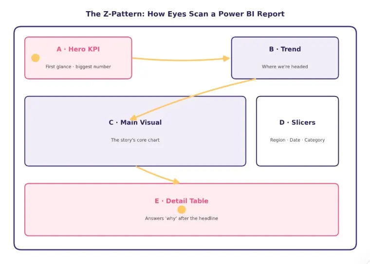
On a landscape Power BI canvas, eyes typically move in a Z: starting top-left, sweeping right, cutting diagonally down, then finishing along the bottom. On text-heavy or list-style reports, attention instead falls into an F-shape. Either way, the most important visual belongs where the eye lands first top-left with supporting context following the same natural path.
Use Colour and Size to Signal Priority, Not Decoration
Colour and size should mean something in a data story a highlight colour reserved only for the number that matters, muted grays for context values. When every visual is the same size and every category gets its own bright colour, nothing signals "start here," and the viewer has to do the work the design should have done.
Using Data Dashboards to Enhance Data Storytelling
A static report tells one story to everyone. An interactive Power BI dashboard lets the same report adapt its story to whoever is looking at it, without losing the guided structure.
- Slicers and filters let a regional manager see their own story same layout, personalized numbers instead of scrolling through every region to find their own.
- Drill-through pages hold the follow-up story: the headline page shows what happened, and drilling in reveals why, without cluttering the first screen.
- Tooltips carry extra narrative context exactly where it's needed, without adding another visual to the page.
- Bookmarks and buttons can guide a viewer through a report in a fixed sequence, effectively turning the dashboard into a presentation.
Report Zones at a Glance
Zone | Placement | Purpose | Visual Type |
A | Top-left | Hero KPI — total sales vs. target, first thing seen | Card / KPI visual |
B | Top-right | Trend context — is the number moving up or down | Line / sparkline chart |
C | Center band | The main story — sales by region or category | Bar / map visual |
D | Right rail | Interactivity — region, date, category filters | Slicers |
E | Bottom | Supporting detail — the "why" behind the headline | Detail table / matrix |
The Key Components of Data Storytelling
Most frameworks for data storytelling come back to the same three building blocks. A strong Power BI report needs all three working together missing any one of them breaks the story.
Component | What It Covers | In Power BI |
Data | Accurate, relevant, and timely numbers pulled from a trusted, validated model | Clean star-schema data model, refreshed on a reliable schedule |
Narrative | The context, comparison, and "so what" that gives the numbers meaning | Titles, callouts, tooltips, and layout order that explain what changed and why |
Visuals | Chart types, colour, and hierarchy chosen to match the message, not just the data type | Consistent chart styles, a clear focal point, and deliberate use of colour and size |
Conclusion
A well designed Power BI report does more than display data. It creates a clear path from the most important business insight to the supporting details behind it. By applying a thoughtful Power BI report layout, choosing visuals that match the message, and using colour, size, and positioning to establish visual hierarchy, businesses can make complex information easier to understand and act on.
Data storytelling becomes even more effective when interactive features such as slicers, drill through pages, tooltips, and bookmarks are used with purpose. The goal is not to fill the report with more visuals, but to create a focused experience where every element contributes to the overall story.
By combining accurate data, meaningful visuals, and a deliberate narrative structure, Power BI dashboards can help stakeholders quickly understand performance, identify trends, investigate problems, and make informed business decisions. A strong report should always answer the most important question first and make the next question easy to explore.