
Choosing the Right Visual
Power BI gives you more than twenty chart types, and that's exactly the problem. Most "chart selection" guides just list them all bar, line, pie, waterfall, funnel, ribbon and leave you to guess. That's not a framework, it's a catalogue.
| 1 | Comparison | How do categories stack up against each other? |
| 2 | Trend | How is a value changing over time? |
| 3 | Distribution | How are values spread out, and where do they cluster? |
| 4 | Part-to-Whole | How does each piece contribute to the total? |
Comparison: How Do Categories Stack Up?
Use comparison visuals whenever the question is about ranking or measuring the gap between discrete categories regions, products, salespeople, departments at one point in time or across a few grouped periods.
Best Power BI visuals
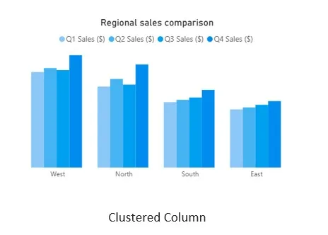
- Clustered Column / Clustered Bar Chart 2–4 categories per group, best for side-by-side comparison across a second dimension (e.g., quarter).
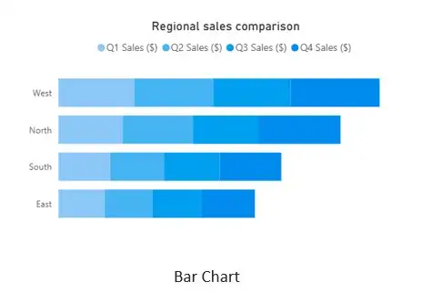
- Bar Chart (single measure) best when you have many categories and long labels; horizontal bars read better than vertical columns.
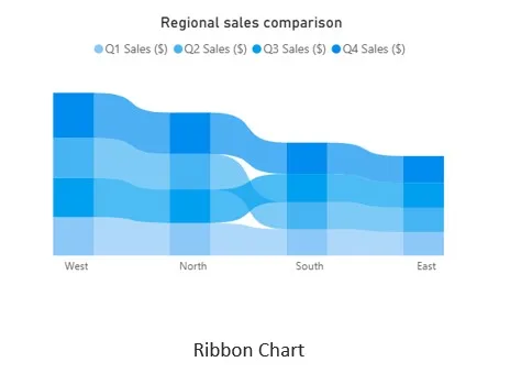
- Ribbon Chart comparison that also needs to show rank changes over time.
Real-time example: Regional sales comparison
Scenario: A retail chain wants to compare quarterly sales performance across its four sales regions for FY2025 to decide where to increase headcount next year.
| Region | Q1 Sales ($) | Q2 Sales ($) | Q3 Sales ($) | Q4 Sales ($) |
| North | 245,000 | 268,000 | 251,000 | 312,000 |
| South | 198,000 | 205,000 | 212,000 | 235,000 |
| East | 176,000 | 182,000 | 190,000 | 201,000 |
| West | 289,000 | 301,000 | 295,000 | 340,000 |
BUILD IT
- Visual: Clustered Column Chart
- Axis: Region
- Legend: Quarter
- Values: Sum of Sales Amount
Trend : How Is It Changing Over Time?
Use trend visuals whenever time is on the X-axis and the question is about direction, momentum, seasonality, or inflection points growth, decline, acceleration, or a turning point worth investigating.
Best Power BI visuals
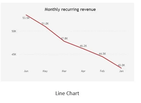
- Line Chart the default choice for one or a few continuous series over time.
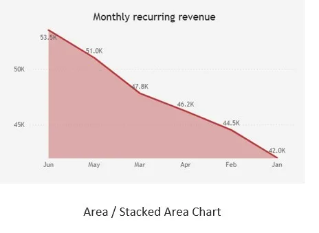
- Area / Stacked Area Chart trend plus a sense of cumulative volume; use sparingly, only 2–3 series.
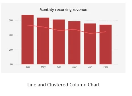
- Line and Clustered Column Chart trend of one measure (e.g., growth %) against the volume of another (e.g., revenue) on a secondary axis.
Real-time example: Monthly recurring revenue (MRR)
Scenario: A SaaS company is tracking Monthly Recurring Revenue through 2025 to spot seasonal dips early and confirm whether the growth trajectory is accelerating or flattening.
| Month | MRR ($) | Month | MRR ($) |
| Jan | 42,000 | Jul | 55,800 |
| Feb | 44,500 | Aug | 54,200 |
| Mar | 47,800 | Sep | 58,900 |
| Apr | 46,200 | Oct | 61,200 |
| May | 51,000 | Nov | 63,800 |
| Jun | 53,500 | Dec | 67,500 |
BUILD IT
- Visual: Line Chart
- Axis: Month (Date hierarchy, continuous)
- Values: MRR measure
Distribution : How Are Values Spread Out?
Use distribution visuals when the question isn't about a single total or a trend, but about the shape of the data where most values cluster, how wide the spread is, and whether outliers exist.
Best Power BI visuals
- Histogram (binned Column Chart, or the Histogram Chart custom visual) frequency of a continuous measure grouped into ranges.
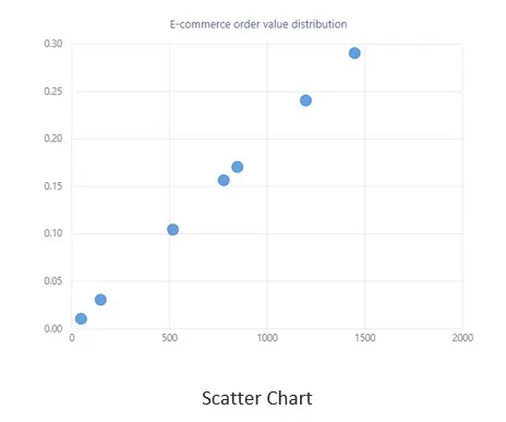
- Scatter Chart relationship and spread between two continuous measures, especially to spot outliers or clusters.
- Box and Whisker Chart (custom visual) median, quartiles, and outliers across categories.
Real-time example: E-commerce order value distribution
Scenario: An online retailer processed 5,000 orders last month and wants to understand typical basket size to decide where to set a "free shipping over $X" threshold.
| Order Value Band | Number of Orders | % of Total Orders |
| $0 – $25 | 850 | 17.0% |
| $25 – $50 | 1,450 | 29.0% |
| $50 – $75 | 1,200 | 24.0% |
| $75 – $100 | 780 | 15.6% |
| $100 – $150 | 520 | 10.4% |
| $150 – $200 | 150 | 3.0% |
| $200+ | 50 | 1.0% |
BUILD IT
- Visual: Column Chart on a binned field (Power BI: right-click the OrderValue field → New Group → set bin size to 25)
- Axis: OrderValue (bins)
- Values: Count of OrderID
A second distribution case: relationship between two variables
Scenario: The same retailer wants to know whether customer age relates to how much customers spend, to decide whether age-targeted marketing is worth the investment.
| Customer Age Group | Avg. Order Value ($) | Order Count |
| 18–24 | 38 | 620 |
| 25–34 | 64 | 1,340 |
| 35–44 | 79 | 1,180 |
| 45–54 | 71 | 890 |
| 55–64 | 58 | 610 |
| 65+ | 45 | 360 |
Part-to-Whole : How Does Each Piece Contribute?
Use part-to-whole visuals when the question is about proportion and contribution to a total market share, budget allocation, revenue mix not about ranking category-to-category performance over time.
Best Power BI visuals
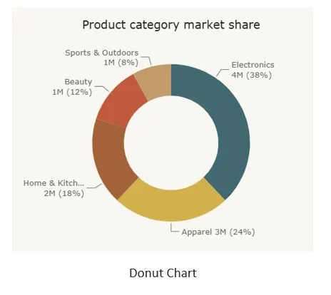
- Donut / Pie Chart a single snapshot, 5 categories or fewer.
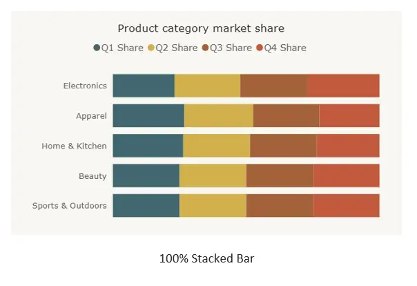
- 100% Stacked Bar / Column Chart part-to-whole across several periods or several groups at once.
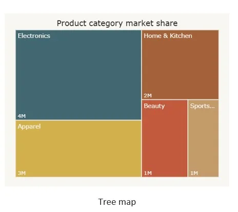
- Tree map many categories (10+) or a hierarchy (category → sub-category), where slice size communicates scale better than a crowded pie.
Real-time example: Product category market share
Scenario: A retailer wants to show leadership which product categories make up this year's total revenue, to guide next year's inventory investment.
| Category | Revenue ($) | Share of Total |
| Electronics | 4,180,000 | 38% |
| Apparel | 2,640,000 | 24% |
| Home & Kitchen | 1,980,000 | 18% |
| Beauty | 1,320,000 | 12% |
| Sports & Outdoors | 880,000 | 8% |
BUILD IT
- Visual: Donut Chart
- Legend: Category
- Values: Sum of Revenue
When the pie stops working: tracking the mix over time
The moment leadership asks "has this mix shifted across the year?", a single pie or donut per quarter breaks down comparing four separate pies side by side means comparing slice angles across charts, which the eye is genuinely bad at.
| Category | Q1 Share | Q2 Share | Q3 Share | Q4 Share |
| Electronics | 35% | 37% | 38% | 41% |
| Apparel | 26% | 25% | 24% | 22% |
| Home & Kitchen | 19% | 18% | 18% | 17% |
| Beauty | 12% | 12% | 12% | 12% |
| Sports & Outdoors | 8% | 8% | 8% | 8% |
The Quick-Reference Decision Matrix
Print this, pin it above your desk, or drop it into your Power BI style guide. When in doubt, ask the question in the left column first — the chart choice follows from it, not the other way around.
| If your question is about… | Reach for | Avoid |
| Ranking categories against each other | Clustered Bar / Column | Pie chart with 6+ slices |
| Direction and momentum over time | Line / Area Chart | Bar chart per period (obscures the trend line) |
| Spread, clusters, and outliers | Histogram / Scatter / Box-Whisker | A single average value or KPI card |
| Contribution to one total, single snapshot | Donut / Pie (≤5 slices) | Pie chart used across multiple time periods |
| Contribution to a total, across periods | 100% Stacked Bar/Column | Multiple side-by-side pies |
| Many categories or a hierarchy | Tree map | Pie chart with 10+ slices |
Five Chart-Selection Mistakes That Quietly Mislead
- The rainbow pie chart
Once a pie chart passes five or six slices, the smallest wedges become visually indistinguishable and the legend does more work than the chart itself. Switch to a bar chart sorted descending, or a tree map.
- Dual axis with mismatched scales
Combining a revenue line (in millions) with a count line (in hundreds) on the same dual-axis chart can make two completely unrelated trends look like they move together. Always label both axes clearly, and consider two separate small-multiple charts instead.
- Line charts for categorical (non-time) data
A line implies continuity and order. Drawing a line between "North, South, East, West" implies a progression that doesn't exist between those categories and can visually suggest a trend that isn't real. Use a bar chart for discrete categories.
- Truncated Y-axes on comparison charts
Starting a column chart's Y-axis at 90 instead of 0 can make a 2% difference look like a 200% difference. Always start value axes at zero for bar and column charts; reserve axis-start adjustments for line charts tracking small fluctuations, and label clearly when you do.
Conclusion
The fastest way to get better at chart selection in Power BI isn't memorizing which icon does what it's starting every report page by writing down, in one sentence, the actual question a stakeholder is trying to answer. "How do our regions compare", "is revenue accelerating", "where do most of our orders fall", "what share does each category hold" each sentence points to a chart family before you've opened Power BI at all.