
This Power BI First Report Tutorial is the moment the series stops explaining Power BI and lets you actually use it. Using the same sample sales data, you'll place a card, a bar chart, and a table on a blank page and end up with a real, working report no new theory, just doing.
What You'll Build
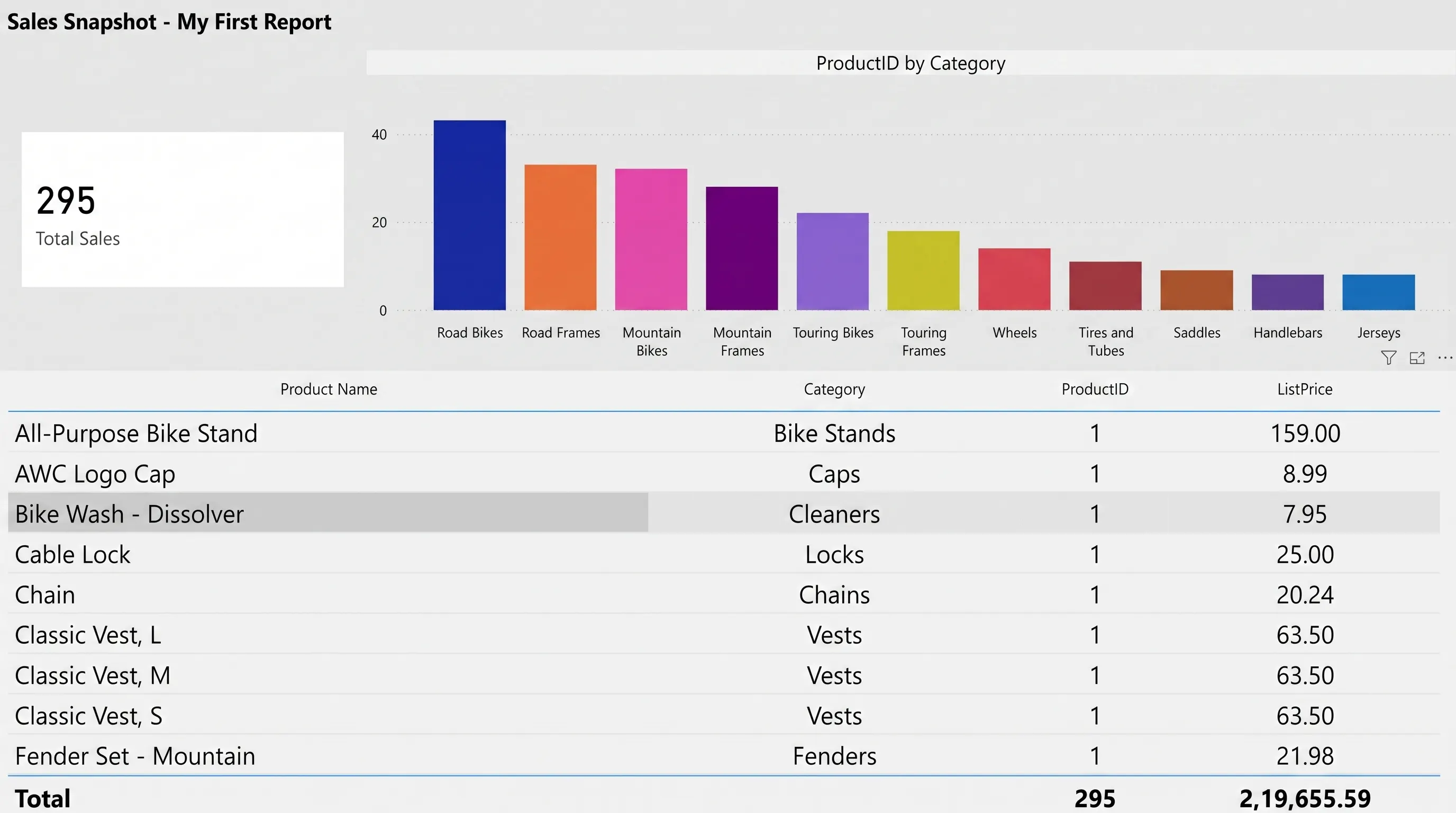
By the end of this tutorial you'll have a one-page report with three visuals working together a Total Sales card, a Sales by Category bar chart, and an Order Details table. Here's the finished result.
Before You Start
This tutorial assumes you've already loaded the sample sales data from three tables Customers, Products, and Sales. If you skipped that post, go back and load the data first; everything here builds directly on it.
- Sales — the fact table, with Amount, Quantity, and Order Date
- Products — with Category and Product Name
- Customers — with City and Segment
- Open a blank page in Report view. That's it you're ready.
Step 1: Add a Card for Total Sales
A card is the simplest visual in Power BI one number, no axes, no legend. It's the right first move because there's nothing to get wrong.
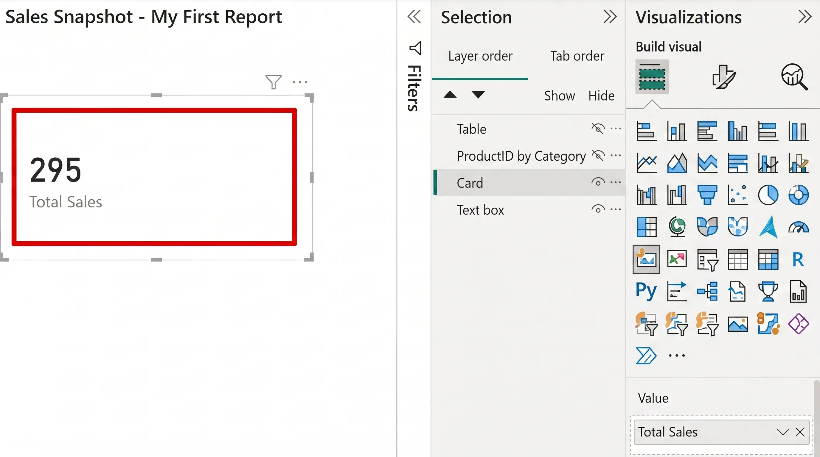
- In the Visualizations pane, click the Card icon.
- With the empty card selected, drag Amount from the Data pane into the Fields well.
- Power BI automatically sums Amount and displays the total that's the Σ (sigma) behavior from action.
Step 2: Add a Bar Chart for Sales by Category
Next, a chart that actually compares things. A clustered column chart is the default workhorse for “how does A compare to B” questions.
- Click an empty area of the page, then click the Clustered column chart icon in the Visualizations pane.
- Drag Category (from the Products table) into the X-axis well.
- Drag Amount into the Y-axis well. Power BI sums it per category automatically.
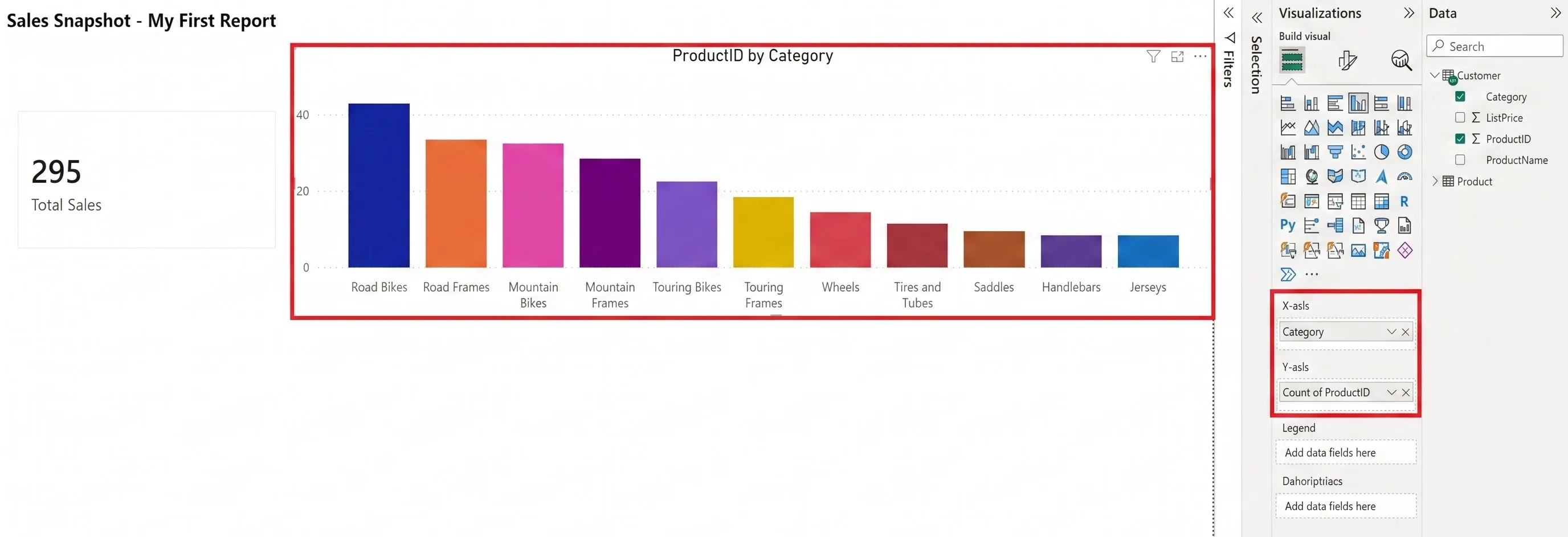
Resize and drag the chart so it sits beside the card without overlapping. Power BI snaps visuals to a light grid, so alignment is easier than it looks.
Step 3: Add a Table for the Order Details
Cards and charts summarize; a table shows the underlying rows. It's useful whenever someone asks “can I see the actual numbers behind that chart?”
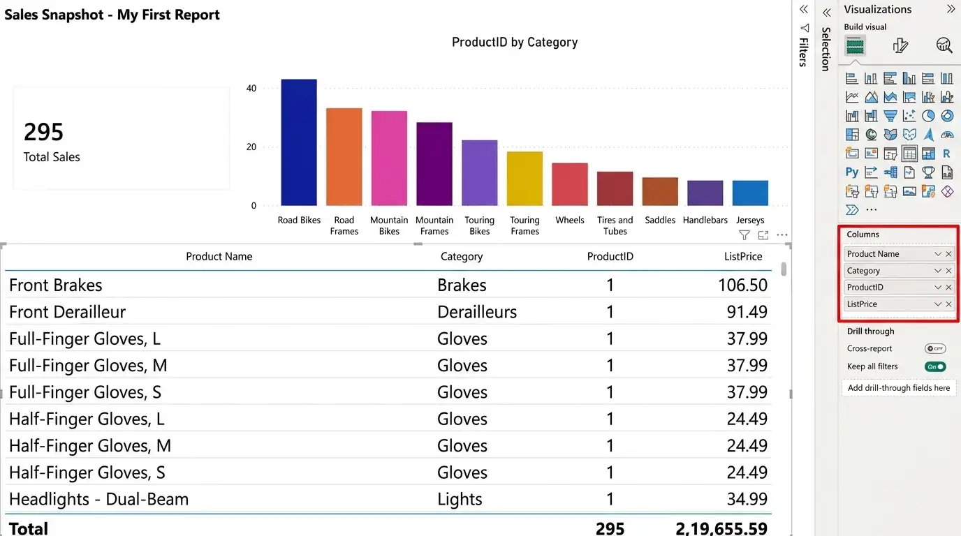
- Click the Table icon in the Visualizations pane.
- Drag in Category, Product Name, and Amount, in that order, under Columns.
- Widen the table so all three columns are comfortably readable.
Step 4: Arrange Your Report Like a Pro
A report with the right visuals but a messy layout still reads as unfinished. A few small habits fix that instantly:
- Put summary visuals (cards) at the top, detail visuals (tables) at the bottom that's the order people read in.
- Leave consistent gaps between visuals; don't let them touch.
- Add a text box with a plain-language title (“Sales Snapshot” beats “Page 1”).
- Use View → Snap objects to grid (Ribbon covers where this lives) to keep edges aligned.
Quick Reference: Which Visual, When
| Visual | Best for | Fields it needs |
| Card | One key number | A single summarized field (e.g. Σ Amount) |
| Bar / column chart | Comparing categories | A category field + a summarized number |
| Table | Showing raw rows | Any combination of columns, unsummarized or summarized |
Frequently Asked Questions
What's the difference between a card and a Multi-row Card in Power BI?
A Card displays a single value or KPI, while a Multi-row Card displays multiple fields or values together in a list.
Do I need DAX to build my first Power BI report?
No. Sum, Average, and Count are handled automatically by dragging a numeric field into a well that's the Σ behavior. DAX (custom measures) becomes useful later, once the built-in aggregations stop being enough.
Why is my card showing a count instead of a sum?
Power BI guesses the aggregation type when a field is added. Click the small dropdown on the field inside the well and choose Sum, Average, or whichever aggregation fits.
Can I resize visuals after I've built them?
Yes, click a visual once to select it, then drag any corner handle. Power BI's snap-to-grid keeps edges aligned automatically.