
The first time you open Power BI Desktop, you're greeted by a mostly blank screen surrounded by buttons, panes and icons. It looks like a lot. The good news in your first 30 minutes you only need to understand six areas, and once you can name them, everything else in Power BI becomes a variation on the same routine pick some data, drop it on the canvas, tidy it up.
This post walks you through those six areas one at a time. No formulas, no technical terms just what each part of the screen does and when you'll use it.
The big picture
Here's the whole window with the six areas numbered. Keep this map in mind every section below matches one of these numbers.
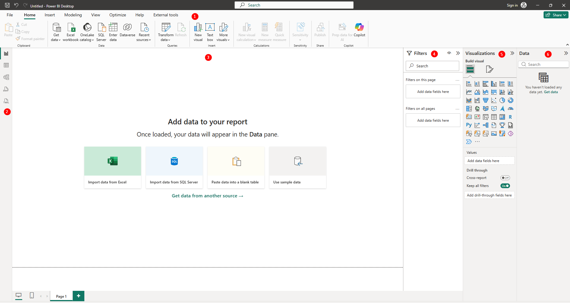
A useful way to think about the layout your data lives on the right, your report lives in the middle, and your commands live at the top. Almost everything you do is a drag from right to middle.
1. The ribbon your command centre
The strip across the top works exactly like the one in Word or Excel tabs along the top, buttons underneath. You'll live on the Home tab for a long while, because it holds the handful of buttons that matter most on day one.

- Get data — this is how every project starts. It opens a menu of places Power BI can pull data from: Excel files, databases, websites, and hundreds more.
- Transform data — opens a separate window where you can clean up messy data (remove columns, fix headers, filter rows) before it lands in your report.
- Refresh — re-reads your data source so your report shows the latest numbers.
- Publish — when your report is ready, this sends it to the Power BI web service so others can see it.
Tip: If you ever feel lost in the ribbon, go back to Home. Nearly everything a beginner needs is on that one tab.
2. The three views: Report, Data, Model
On the far left edge of the window there's a thin strip with three small icons. These switch the entire screen between three different ways of looking at your work. Same file, three lenses.
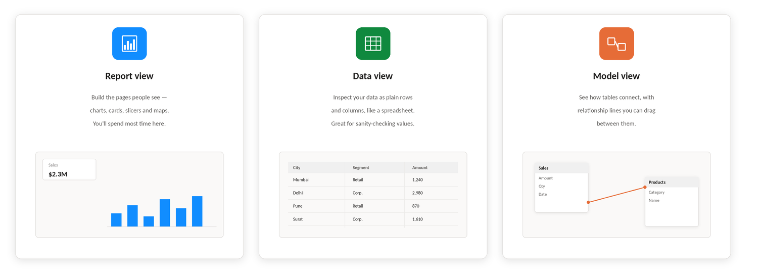
Report view is where you build the actual pages people will see charts, numbers, maps, and buttons. If Power BI were PowerPoint, this would be the slide editor.
Data view (sometimes labelled Table view) shows your data as plain rows and columns, like a spreadsheet. It's the quickest way to sanity-check that your numbers loaded correctly open it whenever a chart looks wrong and you want to peek at the raw values behind it.
Model view shows each of your tables as a box, with lines between boxes showing how they're connected. For example, a line between a Sales table and a Products table tells Power BI "these belong together match them up by product." You won't need this on day one, but it's where you'll go when you start combining more than one table.
3. The report canvas where reports take shape
The big white rectangle in the middle is your page. Everything you build sits here. You add a chart either by clicking a chart icon in the Visualizations pane, or simply by ticking a field in the Data pane and letting Power BI pick a sensible chart for you.
Along the bottom you'll see page tabs, just like sheet tabs in Excel. One report can have many pages an overview page, a details page, and so on. Click the plus sign to add another.
Tip: Charts on the canvas talk to each other. Click a bar in one chart and watch every other chart on the page filter itself to match. This is Power BI's party trick try it early, it's the moment the tool 'clicks' for most people.
4. The Filters pane control what's included
The Filters pane decides which slice of your data appears. Rather than one filter list, it has three levels stacked on top of each other, and the difference between them is simply how far the filter reaches:
- Filters on this visual — applies only to the single chart you have selected.
- Filters on this page — applies to every chart on the current page.
- Filters on all pages — applies everywhere, across every page of the report.
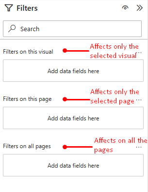
To use any of them, drag a field from the Data pane into the level you want, then tick the values to keep. A common beginner setup: put Year on "all pages" so the whole report shows one year, and use visual-level filters for one-off tweaks.
5. The Visualizations pane pick a chart, feed it fields
This pane does two jobs. The grid of icons at the top is a catalogue of chart types bar, line, pie, map, card, table and more. Click one and an empty placeholder appears on your canvas.
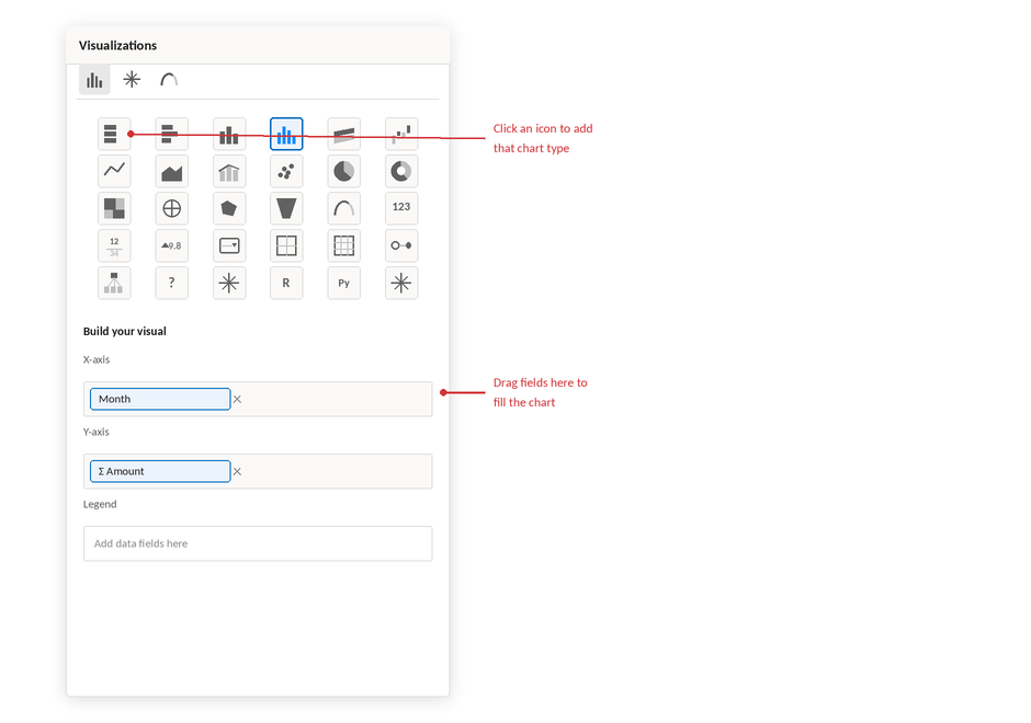
Below the icons are the field wells labelled boxes such as X-axis, Y-axis and Legend. This is where you tell the chart what to show. Drag Category into X-axis and Amount into Y-axis, and your empty placeholder instantly becomes a bar chart of sales by category.
Changed your mind about the chart type? Just click a different icon while the chart is selected Power BI keeps your fields and redraws it. Swapping between a bar chart, a line chart, and a table takes seconds, so experiment freely.
6. The Data pane everything you loaded
The pane on the far right (called Fields in older versions) lists every table and column you've brought in. Click the arrow next to a table name to expand it and see the columns inside.
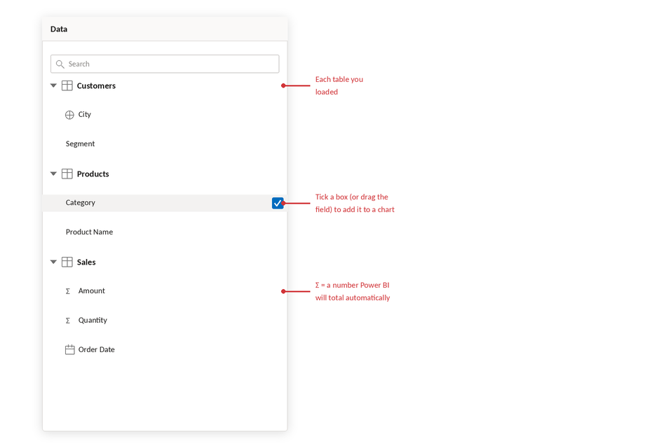
Tables expand to show their columns. The Σ symbol marks numbers Power BI will add up for you.
Notice the small Σ (sigma) symbol next to some fields. It marks numeric columns that Power BI will automatically total when you use them drop "Amount" onto a chart and you get the sum of amounts without doing anything.
There are two ways to use a field: tick its checkbox (Power BI adds it to the selected chart, or creates a new one), or drag it exactly where you want it onto the canvas, into a field well, or into the Filters pane.
Cheat sheet: which pane do I need?
Area | Use it when you want to… |
Ribbon | Bring in data, clean it, refresh it, or publish your finished report |
View switcher | Jump between building pages (Report), checking raw rows (Data), and connecting tables (Model) |
Canvas | Arrange and resize the charts people will actually see |
Filters pane | Limit what's shown — for one chart, one page, or the whole report |
Visualizations pane | Choose a chart type and tell it which fields go where |
Data pane | Find your tables and columns, and drag them into play |
Put it together: a 30-minute first run
Here's a simple route through everything above, using any Excel file you have lying around:
- Minutes 0–5: Open Power BI Desktop and click Get data → Excel workbook. Pick a file, tick a table, click Load.
- Minutes 5–10: Switch to Data view and skim the rows. Do the numbers look right? Any weird blanks? Then head back to Report view.
- Minutes 10–20: In the Data pane, tick one text field and one Σ number field. Power BI draws a chart for you. Try clicking different icons in the Visualizations pane to reshape it.
- Minutes 20–30: Drag a field into "Filters on this page" and tick a couple of values. Watch the chart respond. Add a second chart, then click a bar in the first one and watch them interact.
That's the whole loop: load, check, build, filter. Every Power BI report you'll ever make no matter how sophisticated is that same loop repeated with more care.