
You've already met the three view icons on the left edge of Power BI Views Report, Data, and Model.
The Three views, at a glance
Same file, three different lenses. Report view is where you build, Data view is where you check, and Model view is where your tables connect to each other.
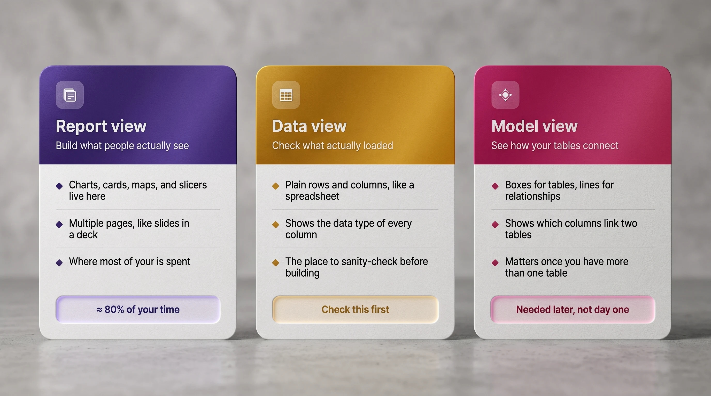
Report view where you build what people see
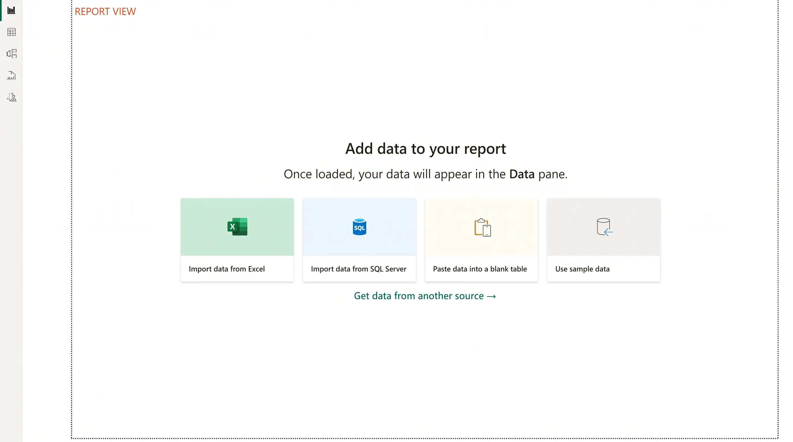
This is the view Power BI opens to by default, and where you'll spend roughly 80% of your time. Every chart, card, map, and slicer lives on the canvas here, arranged across as many pages as your report needs think of pages the way you'd think of slides in a deck. If Power BI were PowerPoint, Report view is the slide editor.
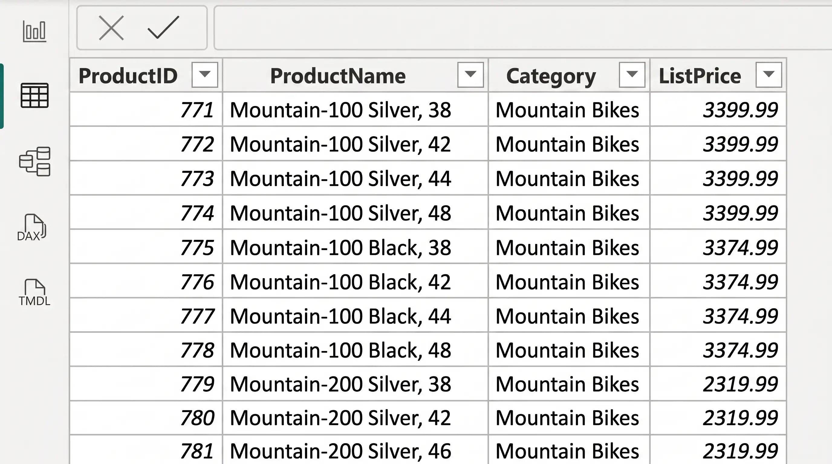
Data view your spreadsheet-style safety check
Data view (sometimes labelled Table view) shows your data as plain rows and columns, exactly like a spreadsheet no charts, no canvas, just the numbers and text you actually loaded. Look at the small icon next to each column header: a calendar means Power BI has read that column as a date, a sigma (Σ) means a number, and ABC means text. Those three little icons are the single most useful thing on this screen, because they tell you before you build anything whether Power BI understood your data the way you meant it.
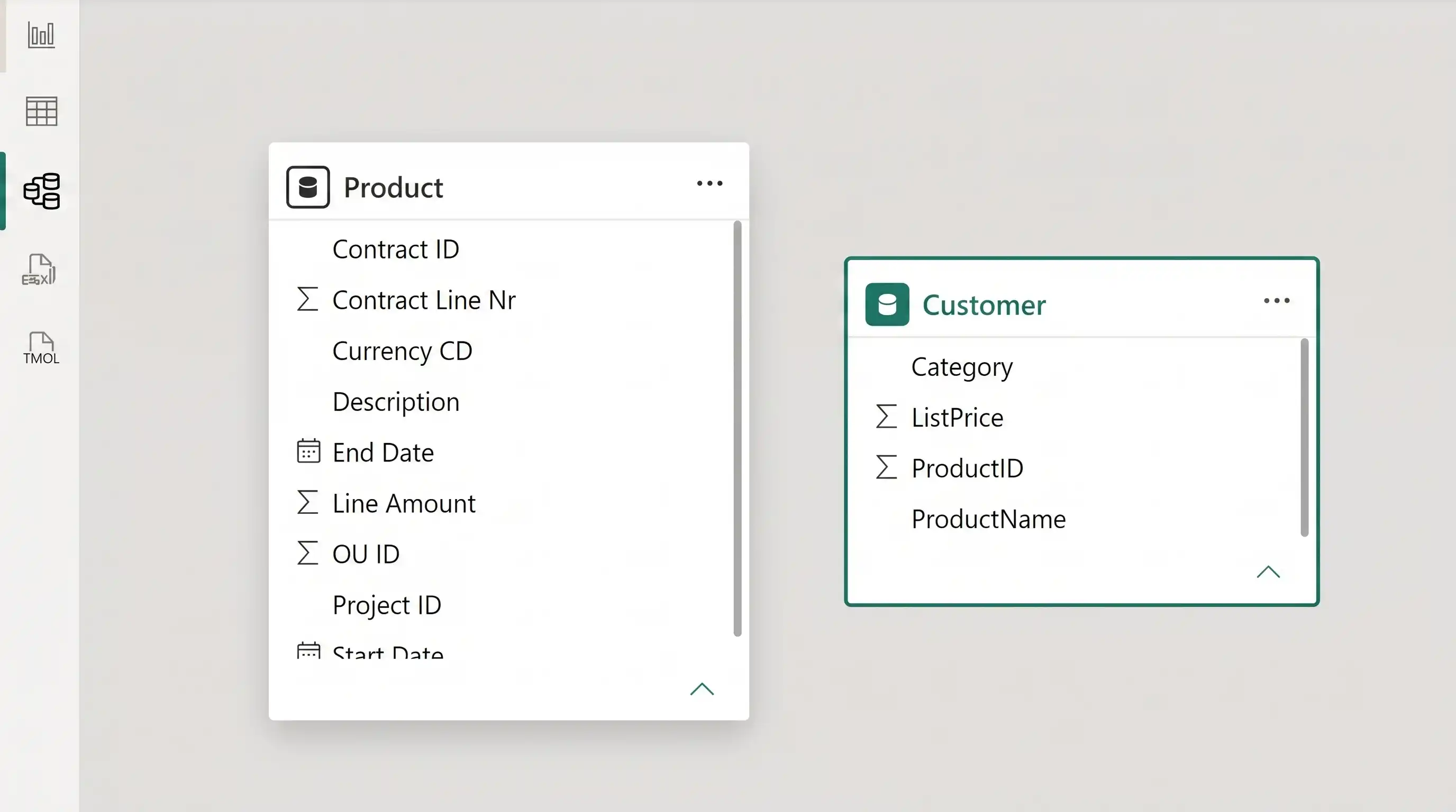
Model view how your tables relate
Model view shows each table you've loaded as a box, with lines drawn between boxes wherever Power BI has matched a column in one table to a column in another. A line between a Sales table and a Products table tells Power BI "these belong together match rows by product." You won't need this view with a single table, but it becomes essential the moment your report combines two or more.
The beginner mistake: building visuals before checking data types
Here's the pattern that trips up almost every beginner. You load a file, and instead of a quick detour through Data view, you go straight to Report view and start dragging fields onto the canvas. Everything looks fine until it doesn't: a date column sorts like text, a currency column won't total, or an ID code loses its leading zeros. Now you're debugging a chart when the real problem was a data type, set the moment the file loaded.
Power BI has to guess a data type for every column the moment you load it, and CSV files in particular give it very few clues. A column of dates can easily land as plain text; a column of prices with a currency symbol can do the same. The chart you build afterwards isn't wrong it's faithfully representing data that was never quite what you thought it was.
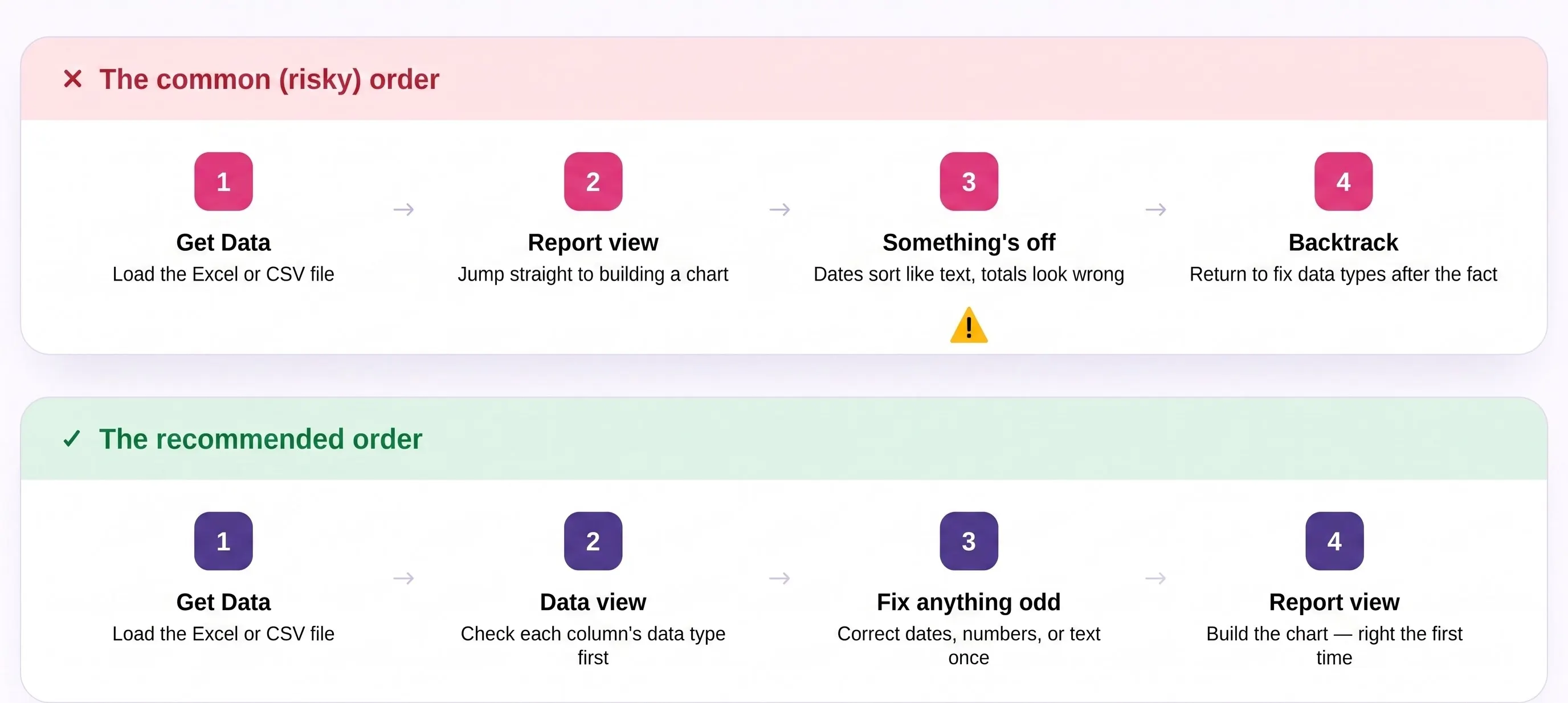
Tip: Make it a habit: after every Get Data, click Data view before you click anything in the Visualizations pane. It takes ten seconds and saves you from rebuilding charts later.
How to check (and fix) data types in Data view
- Switch to Data view. Click the middle icon on the view switcher, on the far-left edge of the window.
- Scan the column header icons. Calendar = date, Σ = number, ABC = text. Anything that doesn't match what the column should be is worth a closer look.
- Select the column and open Column tools. The Data Type dropdown shows exactly what Power BI has assigned, and lets you change it.
- Fix mismatches. Change Text to Date for date columns, or to Whole Number / Decimal Number for anything you'll need to total or average.
- Watch for conversion warnings. If Power BI can't convert every row to the new type, it will flag errors that's valuable early warning about messy source data, not a bug.
- Repeat for every new source. This is a habit, not a one-time task check again each time you add a table.
Common data type problems
Symptom | Likely cause & fix |
Dates sort alphabetically, not chronologically | Column imported as Text — change its data type to Date |
A total or average shows blank or an error | Column isn't truly numeric — check for stray text, symbols, or blanks, then set to Whole Number / Decimal |
Currency values won't sum | Currency symbol or thousands comma imported as part of the text — clean in Power Query, then set to Decimal Number |
ID codes lost their leading zeros (00123 → 123) | Column was set to a Number type — change it back to Text |
A text column sorts in a strange order | Expected — text sorts alphabetically; add a numeric column if you need numeric sort order |
Put it together: a data-type check in under 5 minutes
Here's a simple route through everything above, right after loading any new file:
- Minute 0–1: Get Data, load your Excel or CSV file as usual.
- Minutes 1–3: Switch to Data view and scan the column header icons calendar, Σ, or ABC.
- Minutes 3–4: Fix any column whose icon doesn't match what it should be.
- Minutes 4–5: Switch back to Report view and start building with data you can trust.
That's the whole habit, and it costs you almost nothing. The reports that feel effortless to build are, almost without exception, the ones where this five-minute check happened first.
Next up in the series: shaping and cleaning data with Power Query removing columns, fixing headers, and splitting messy fields before they ever reach your report.
Frequently asked questions
What's the fastest way to check data types in Power BI?
Switch to Data view and look at the small icon next to each column header a calendar means date, Σ means number, and ABC means text. Mismatches are usually obvious at a glance.
Why did my date column import as text?
This is especially common with CSV files, which carry no formatting information Power BI has to guess a data type from the values alone, and inconsistent date formats are easily misread as plain text.
Do I need Model view if I only have one table?
No. Model view becomes useful the moment you load a second related table, since that's when you need to see and sometimes fix how tables are connected.
Can I fix data types after I've already built charts?
Yes, and Power BI will usually update the charts automatically. It's just extra work compared to catching the issue in Data view first, since you may need to re-check any visuals built on the affected column.